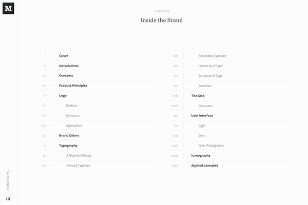
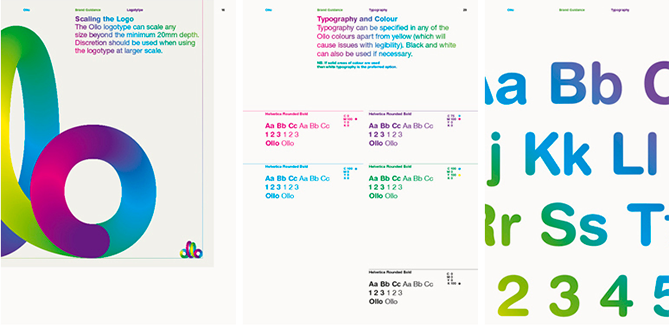
A style guide is a group of elements that act as a guideline for a design to give it a personality. It also helps achieve consistency. Hubspot defines it as “the collection of specifications that help you present a consistent visual brand to the world. It’s the guardrails that you share both externally and internally that help you say who and what your brand [design] is. It’s how you communicate (both implicitly and explicitly) what your brand [design] stands for.”.
Simply put, it is a documentation of all the key elements of your design.
What’s the general process for creating one?
It typically comes after the creation of a mood board. But as we know, the design process isn‘t always linear. Anyway, you can begin creating a style guide by culling ideas from your mood board and matching them with yours to create something unique.
What should it look like?
Like this ?
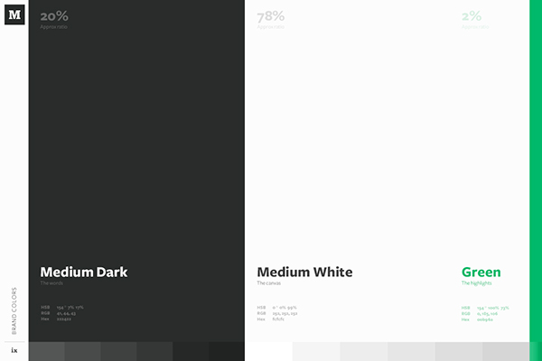
Like this ?
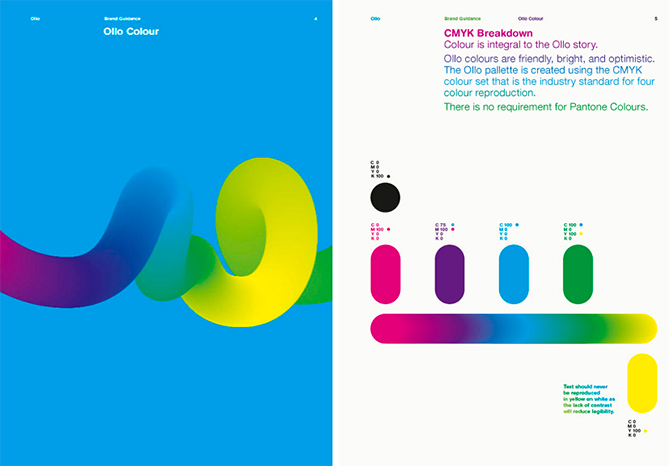
It should contain things like:
- Brand logo
- Colour palette
- Iconography
- Typography
- UI elements — size, spacing, etc.
How’s a Style Guide different from a Mood Board
Let’s get straight down to a list:
- A mood board is created to organize creative ideas for a design. In comparison, a style guide is an established guideline for a design drawn from those creative ideas.
- A mood board inspires the thematic feel of a design. A style guide clearly outlines this
- Creating a mood board will help save time by addressing design issues early and seeing what changes can be made. A style guide is usually often not altered.
- Mood boards are a collage of images, patterns, colour swatches, fonts, logo ideas, etc., that are drawn from other sources. However, style guides are created specifically for a design, the real logo, colours, fonts, buttons as well as rules on how to use them. You could use established sites like Pinterest or Evernote to convey your style ideas.
- A mood board could be done either physically or digitally. However, a style guide for a UX design is usually done digitally.
